Flutter · device simulation

Every device.
One app run.

Switch your running Flutter app to an iPhone, an iPad in landscape or a 200%-text-scale Pixel — instantly, without a rebuild or a simulator. Screen size, safe areas, locale, brightness, text scale and accessibility all follow, so layout problems surface while you're still writing the layout.

$ flutter pub add device_preview
Live demo

Not a mockup.
A running app.

On the left, a Flutter app compiled for the web. On the right, the same controls the DevTools extension gives you, rebuilt in HTML and talking to the app over postMessage instead of the VM service. The picker at the top of the panel swaps what runs inside the simulated device: the stock counter app, with nothing but a theme change and DevicePreview.enable(); a todo app with navigation, bottom sheets, dialogs and toasts; or the device lab, which shows off everything a simulation touches — labeled safe areas under the notch, a clock that follows the locale and the 24-hour toggle, a layout that splits around a foldable's hinge. Either way: pick a device, rotate it, push the text scale, and the app re-lays itself out live.

Loading the demo…
a 3 MB Flutter web app, fetched once
Latest news

3.0 moves the simulation
under your app.

August 2026 v3.0

3.0 is a rewrite. Until now, device_preview was a widget: it sat at the root of your tree, injected a MediaQuery underneath itself, and drew its own control panel next to the simulated screen. That worked, but the simulation only existed below that widget — and it lived inside the app it was measuring. The idea is unchanged; everything under it has moved one layer down.

The simulation now lives in a custom WidgetsBinding, installed by one line before runApp. It wraps the engine's PlatformDispatcher and FlutterView, so screen size, pixel ratio, safe areas, orientation, locale, brightness, text scale and accessibility flags are simulated at the boundary the framework itself reads. Nothing is injected halfway down the tree, so MediaQuery.of is right everywhere — inside routes, dialogs and overlays — and code that reads View.of(context) or the dispatcher directly agrees with it. Pointer packets pass through the same seam, which is how your mouse can be delivered to the app as a finger. And because it is a binding rather than a widget, flutter_test can install it too — the same simulation, with no wrapper around the app.

That is what makes it solid. A wrapper can only simulate what sits below it, so an app effectively held two answers to the same question — the engine's and the injected one — and anything that read the wrong one, or that built its own MediaQuery from the view, quietly saw the real device. There is nothing to opt into now and nothing to remember: no builder: to thread through MaterialApp, no rule about staying under the wrapper, no widget that has to be first. And it is consistent by construction: metrics, safe areas, locale resolution, text scaling, accessibility flags and pointer routing all come through the one seam, so they cannot drift apart from each other, and every change travels the notification path the framework already uses for a real device — a rotation or a brightness switch is indistinguishable from the engine sending one. The simulation applies everywhere or nowhere; there is no half-simulated tree. It is also why a golden captured this way matches what the panel just showed you: the same code path, not a lookalike.

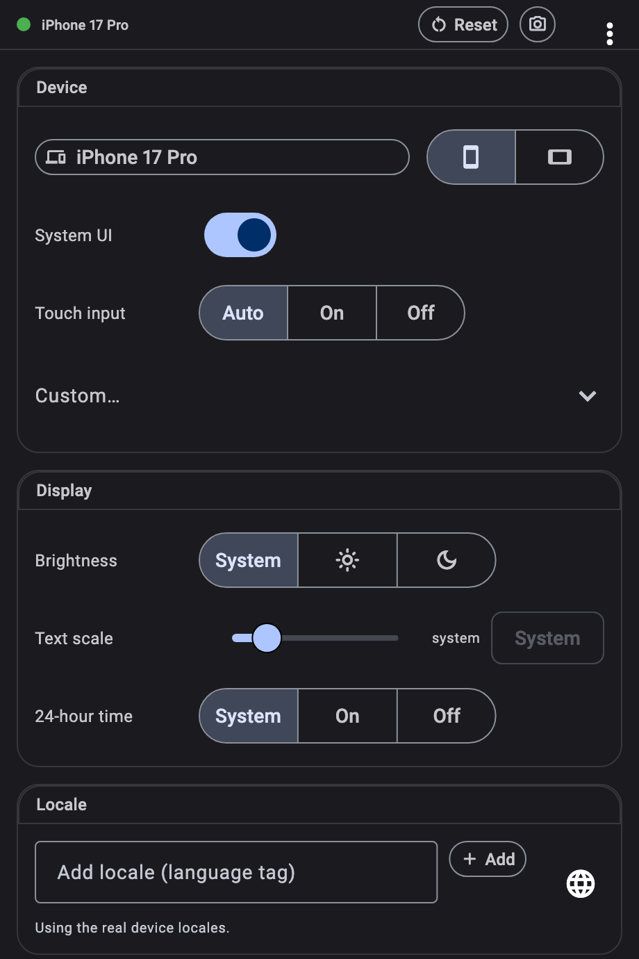
The controls moved to Flutter DevTools for the same reason. A panel that lives in your widget tree perturbs what it measures: it adds ancestors, competes for focus and theme, and takes screen away from the app you are trying to look at. Outside the tree, your app keeps the whole window and none of the control surface ships with it — the device frames live in the extension, and only the device you selected travels over the VM service. DevTools is already open beside a running Flutter app on every platform, so there is nothing to install and nothing to configure; and when you would rather script the same changes, the controller API and your tests reach them directly.
Why

Ship for devices
you don't own.

You build on one screen. Your users arrive on hundreds — a five-year-old phone with a 320pt-wide screen, a tablet in landscape, a desktop window dragged to half its width, a notched display, a fold.

Add one line to main() and every one of them is a keystroke away. The app you're already running re-lays itself out at the new size, with that device's safe areas, pixel ratio, locale, brightness, text scale and accessibility settings. No rebuild, no simulator boot, no cable.

Because your app reads the simulated values through the same MediaQuery it always used, the things that usually break in front of a customer — a clipped headline, a button under the home indicator, an overflow at 200% text — break in front of you, seconds after you write them.

main.dart — the entire integration
void main() {
  DevicePreview.enable();
  runApp(const MyApp());  // runs as usual — now simulatable
}

The device you don't own

Check the small phone, the tablet in landscape and the half-width desktop window in the time it takes to click three chips. Every screen in the catalog carries real metrics — resolution, pixel ratio and per-orientation safe areas — so what you see is what that hardware would show.

The inset you forgot

Notches, punch-holes, home indicators, hinges and the software keyboard all move in. SafeArea, MediaQuery.padding and viewInsets report the simulated device's values, so content that would hide under a cutout hides now — while you can still fix it.

The user who isn't you

Push text scale to 200%, switch to bold text or reduce motion, reorder locales, flip to dark mode — one panel, live, no device settings to dig through and no state to lose. The accessibility pass stops being a release-week scramble.

Coverage

What gets simulated

Screen size & pixel ratio
Any resolution and density, from a 320pt phone to a 13″ tablet. The app is scaled to fit your window, so a screen larger than your monitor still previews whole.
SCREEN
Safe areas
Notches, punch-holes and home indicators, correct per device and per orientation. SafeArea and MediaQuery.padding respond.
SCREEN
Orientation
Portrait ⇄ landscape in one click, with safe areas rotating the way the real device rotates them.
SCREEN
Folds & hinges
Display features for foldables, so hinge-aware layouts can be checked without a foldable on the desk.
SCREEN
Device frame
The device drawn around your app: its screen outline clips the corners, its body is painted behind. Nothing ships in your app — the frame travels from the DevTools catalog when you pick a device.
SCREEN
System UI
A simulated status bar and gesture pill, laid out from the device's own safe areas and tinted from your app's SystemUiOverlayStyle — so a status bar style is visible while you write it. One switch hides them.
SCREEN
Touch input
Your mouse reported to the app as a finger: drag to scroll a list the way a thumb does — the mouse is not a drag device on desktop or the web — with gestures on their touch paths and no hover. The wheel keeps scrolling. Left on auto it follows the device: on for a phone, tablet or foldable, off for a desktop window.
INPUT
Keyboard insets
The software keyboard's viewInsets reach your layout, so you can see what the keyboard covers.
SCREEN
Locales
A full ordered locale list — your app's locale resolution, translations and Intl date, number and currency formatting all follow.
SYSTEM
Brightness
Light and dark, applied live — ThemeMode.system flips as you toggle.
SYSTEM
Text scale
Up to 200% and beyond, the single fastest way to find overflowing rows and clipped labels.
SYSTEM
Accessibility
Bold text, reduce motion, high contrast, invert colors, disable animations, accessible navigation and switch labels — each independently on, off, or left as the real device.
SYSTEM
24-hour time
Preview date and time UI the way users in 24-hour locales will read it.
SYSTEM
Target platform
Switch Material and Cupertino behaviour — scroll physics, page transitions, adaptive widgets — between iOS, Android, macOS, Windows and Linux. Debug builds only.
DEBUG
Control surface

The controls live
in Flutter DevTools.

A device_preview tab appears in DevTools as soon as your app depends on the package — nothing to install, nothing to configure. Your screen stays entirely for the app you're designing.

Pick a device, rotate it, drag the text scale, flip brightness, reorder locales, toggle accessibility flags. The running app updates as you go, and it keeps its state: the screen you were on, the data you'd loaded, the form you'd half-filled are all still there.

Hot restart doesn't lose your setup. Turn on Keep across restarts and the panel puts your simulated device back the moment the app returns.

↑ Try the panel on the live demo

Device
The catalog, orientation, the simulated system UI, mouse-as-finger — and a custom size when no catalog entry fits.
Display
Brightness, text scale, 24-hour time.
Locale
The ordered locale list your app resolves against.
Accessibility
Seven flags, each on, off, or left as the real device reports it.
Platform
The target platform Material and Cupertino adapt to. Debug builds only.
Get started

One line in main().
Then a tab in DevTools.

  1. Add the package. flutter pub add device_preview — no platform setup, no configuration file, nothing to register.
  2. Enable it before runApp. That is the entire integration, and it is safe to leave in: simulation is active in debug and profile builds and completely off in release, where the binding behaves exactly like WidgetsFlutterBinding.
  3. Open Flutter DevTools and pick the device_preview tab. Choose a device: the app you are already running moves onto it, keeping the screen you were on and the state you had loaded.
main.dart
import 'package:device_preview/device_preview.dart';

void main() {
  DevicePreview.enable();  // debug + profile only
  runApp(const MyApp());
}
API

Or drive it from Dart —
including in your tests.

anywhere.dart — the controller API
final c = DevicePreview.controller;

// full preset, orientation included
await c.applyPreset(DevicePresets.iPhone16Pro);
await c.setOrientation(Orientation.landscape);

// partial overrides, merged over the real device
await c.update((s) => s.copyWith(
  textScaleFactor: 2.0,
  platformBrightness: Brightness.dark,
));

// back to reality
await c.reset();
widget_test.dart — simulated widget tests
void main() {
  final binding =
      TestDevicePreviewBinding.ensureInitialized();

  testWidgets('lays out like an iPhone 16', (tester) async {
    await binding.devicePreview!
        .applyPreset(DevicePresets.iPhone16);
    await tester.pumpWidget(const MyApp());
    // MediaQuery: 393×852 @3x, iPhone 16 safe areas.
  });
}

The same simulation is available to flutter_test and integration_test, so a widget test can assert that a screen fits a small phone, or that nothing overflows at 200% text — and goldens can be captured for a whole matrix of devices in CI, without a device in sight. Presets ship in a separate import, so the ones you never reference are dropped from your build.